Displaying toast messages in Svelte 5
Toast messages are a lovely addition to any interface whether it's your Operating System, mobile or web application.
Since the Svelte 5 release, we have seen some changes to state management, so I’m going to provide my take on how to implement this feature. Along with Svelte, the two other building blocks I used are Tailwind and Melt UI. Creating functional and accessible components like Toasters is never easy, and I found these two provide a nice balance between not having to re-invent the wheel and allowing custom look and feel. This topic deserves its own blog post.
Managing global state
It is important to trigger toast messages from anywhere in the application, so I’m using global state for this. Any page or component should be able to publish a message, and the Toast component needs to be able to subscribe to it.
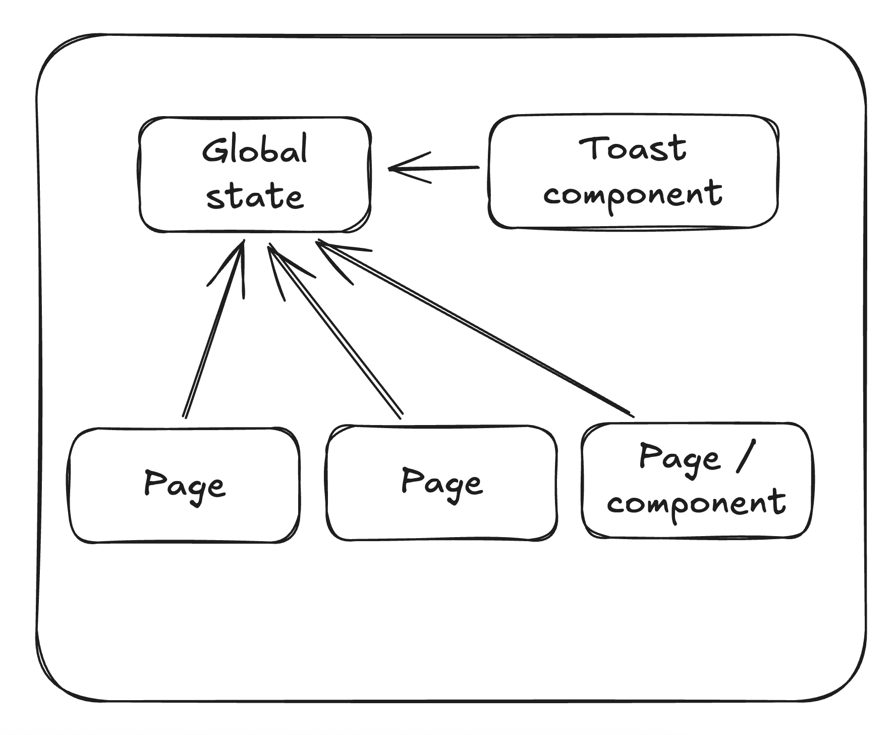
To create global state in Svelte 5, we can make use of the class variation. This is where we utilize the $state rune to store an array of messages. A simple addMessage method creates a unique identifier using the nanoid library, which is useful for Melt UI.
import { getContext, setContext } from 'svelte';
import { nanoid } from 'nanoid';

export type ToastMessage = {
	message: string;
	type: 'success' | 'error';
    id: string;
    isShown: boolean;
};

export class ToastMessages {
	messages: ToastMessage\[\] = $state(\[\]);

	constructor() {}

	addMessage(message: ToastMessage) {
		const id = nanoid();

		this.messages.push({
			...message,
			id,
			isShown: false
		});
	}
}

const ToastMessagesKey = Symbol('ToastMessages');

export function setToastMessages() {
	return setContext(ToastMessagesKey, new ToastMessages());
}

export function getToastMessages() {
	return getContext<ReturnType<typeof setToastMessages>>(ToastMessagesKey);
}
The isShown property is very important here because this is what the Toaster component will use to determine whether to show the message. It will also be toggled in the component once it has been displayed.
The Toaster component is where everything comes together. It subscribes to global state using the $effect rune and combines Melt components with Tailwind classes.
<script lang="ts">
	import { slide } from 'svelte/transition';
	import { createToaster, melt } from '@melt-ui/svelte';

	import { getToastMessages } from '$lib/state/toastMessages.svelte';
	import Icon from '$components/Icon.svelte';
	import type { ToastMessage } from '$lib/types';

	const toastMessages = getToastMessages();

	const {
		elements: { content, description, close },
		helpers,
		states: { toasts },
		actions: { portal }
	} = createToaster<ToastMessage>({});

	$effect(() => {
		toastMessages.messages
			.filter((m) => m.isShown === false)
			.forEach((message) => {
				helpers.addToast({ type: 'background', data: message });
				message.isShown = true;
			});
	});
</script>

<div use:portal class="fixed left-1/2 top-2 z-toaster w-80 -translate-x-1/2 transform">
	{#each $toasts as { id, data } (id)}
		<div use:melt={$content(id)}>
			<div
				in:slide={{ duration: 200 }}
				out:slide={{ duration: 200 }}
				class="mb-2 flex items-center justify-between rounded-lg p-4 text-sm shadow-lg dark:text-gray-900"
				class:bg-red-300={data.type === 'error'}
				class:bg-green-300={data.type === 'success'}
			>
				<div use:melt={$description(id)}>
					{data.message}
				</div>
				<button use:melt={$close(id)} aria-label="close notification">
					<Icon icon="x-mark" />
				</button>
			</div>
		</div>
	{/each}
</div>
The $effect rune is very straightforward. The messages are observed and filtered to find any that haven’t been shown yet. The Melt helper is then used to add the toast to the UI, and the message’s isShown property is set to true to prevent it from appearing again.
The above example uses center positioning with Svelte’s slide transitions. These are obvious points of customization, and you can get creative with them. My use cases required just info and error messages, but you’re not limited to these types. Simply add your own types and styling 🤷.
The next part is calling the toaster in other pages and components! This is quite easy because we just need to import the global state and invoke the addMessage method. Just to see it working, onMount could be used.
import { getToastMessages } from '$lib/state/toastMessages.svelte';
import { onMount } from 'svelte';

const toastMessages = getToastMessages();

onMount(() => {
	toastMessages.addMessage({
		type: 'success',
		message: 'Congrats you have a toast.'
	});
});
Just don’t forget to initialize the state and add the Toaster component. This can be done in the root layout.
<script lang="ts">
	import './app.css';
	import Toaster from '$components/Toaster.svelte';
	import { setToastMessages } from '$lib/state/toastMessages.svelte';

	let { children } = $props();
	setToastMessages();
</script>

<Toaster />
{@render children()}
Happy svelting 🧑💻